
Mobile SEO: A Complete Guide for Beginner’s

What is SEO for Mobile?
Mobile SEO includes all of the best practices, tactics, methodologies, and tools used by developers, webmasters, and marketing professionals to assure website indexing and ranking in mobile device searches.
Mobile SEO recommends a full “revamp” in sites that need to adapt to Internet users’ new behavior patterns, from changes in page HTML, CSS, and JavaScript codes to new parameters in content design and production.
Contrary to popular belief, having a responsive website is not sufficient, even though this is one of the aspects considered in a Mobile Marketing plan.
The term “responsiveness” exclusively applies to a site’s layout automatically adapting to multiple screen sizes. However, many more factors must be considered in mobile navigation, such as:
- Speed: content and page components loading time;
- Page size: usage of data on limited Internet plans;.
- Fidelity: resemblance in terms of features and content to the desktop version
- UX (User Experience): viewing, navigation, agility, and others;
- Usage pattern: regular access, but only for brief periods of time
These and other considerations are compelling professionals and businesses to reconsider the processes of content creation and distribution on the Internet.
Google is once again the great leader and spreader of change in this quest for code and page optimization.
The Importance of Mobile SEO
Mobile devices currently contribute for more than 60% of organic search traffic.
While smartphone searches are increasing, desktops searches are decreasing:
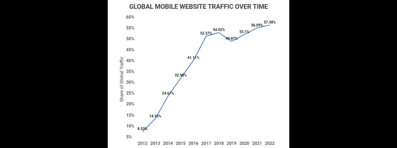
According to Google, 57.38% of in-store buyers used their cellphones to research products while in a store in the past. Even if your business receives a lot of foot traffic, ignoring mobile SEO will cost you a lot.
Google Index Mobile-First
Google indexes mobile-first. This means that it “mostly uses the mobile version of the material for indexing and ranking.” In 2019, this became the default. As a result, whenever Google indexes and ranks your content, the mobile version of your site is prioritized.
There are no different indexes for desktop and mobile. There is only one. It also prioritises mobile.
However, Google will continue to present the page that is most relevant to visitors in search results, whether on desktop or mobile. Your best bet is to cover all bases and, if you haven’t already, optimize your site for mobile consumers.
3 Ways for Making Your Website Mobile-Friendly
When it comes to making your site mobile-friendly, you have 3 options:
- Responsive design
- Dynamic serving
- Separate URLs
Let’s begin with the easiest to use and maintain: responsive design.
1. Responsive Design
You may deliver the same page to mobile and desktop users using responsive design. Every time, the server sends the identical HTML code. CSS changes how the page displays depending on the device.
Because responsive design is great for SEO, it:
- Users can share pages and connect to your content by using a single URL (rather than a distinct “mobile” URL).
- Reduces the likelihood of frequent errors that afflict mobile webpages.
- It takes less time to maintain than other approaches.
- It is not necessary to redirect consumers in order for them to get a device-optimized view (which can reduce load time)
- When Google scans your site, you save resources since Googlebot will only crawl the page once rather than several times.
In fact, Google suggests that you use responsive design for your website.
You won’t have to deal with duplicate content issues or redirects, which might slow down your site if you use responsive design. Instead, develop a separate responsive page for each piece of content. Furthermore, you will not have to worry about the design of responsive pages. The layout will always adapt to different devices as needed.
It’s a win-win situation for mobile SEO.
2. Dynamic Serving
The dynamic serving method displays different HTML depending on the user’s device. However, the URL remains unchanged. Essentially, the material is accessible via the same URL. However, the server assigns a unique code to each device.
However, Google favors responsive design over dynamic serving.
Dynamic serving sites may display the incorrect version of a page to users. As a result, servers may display a desktop version to someone using a smartphone by mistake. This might be aggravating and lead to a negative user experience.
3. Separate URLs
The final option is to create different URLs for your desktop and mobile pages. So you’ll have one URL for your desktop site and another for your mobile site.
The desktop URL looks like any other URL: https://www.website.com/
While the mobile version commonly substitutes a “m” or the word “mobile” for part of the URL:
https://m.website.com/
Google strongly recommends avoiding this tactic.
When someone visits your site, the server detects the device the visitor is using and directs them to the mobile or desktop version of your site.
The problem with this technique is that it can be difficult to manage.
Because each page has two versions, you’ll need to add either rel=”canonical” or rel=”alternate” tags to their HTML codes. This informs Google about the primary version of each page.
- Set a rel=”canonical” tag on mobile pages to point to the desktop version.
- Set a rel=”alternate” tag on desktop pages to point to the mobile version.
If these tags are not properly set, Google may treat desktop and mobile pages as duplicate content. This can be perplexing for Google when attempting to rank the correct website.
If you don’t properly configure the distinct URLs, you may end up spending a lot of time correcting technical SEO issues that you might have avoided in the first place. And your Google rankings may suffer as a result.
How to Check Whether Your Website Is Mobile-Friendly
After you’ve created a mobile version of your site, you can test its usability using a number of free Google tools.
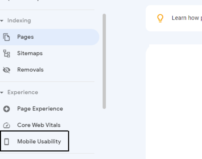
Begin using Google Search Console (GSC).
Google Search Console
If there are any mobile troubles, the tool will notify you. For example, if a page’s text is too small or if clickable elements are too close together.
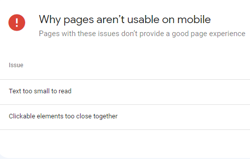
If required, use these insights to make adjustments to pages.
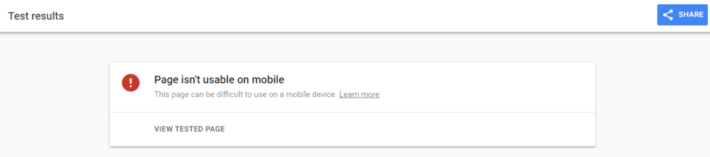
Mobile-Friendly Test Tool
Google’s Mobile-Friendly Test tool is another alternative. You can use this tool to test the mobile usability of particular pages.
There’s no need to log in for this one; simply paste your URL into the tool.

It will then tell you whether the URL you entered is mobile-friendly.
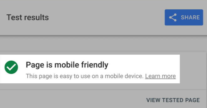
If not, it will inform you of the issues that need to be addressed.
If not, it will notify you of the issues that need to be addressed.
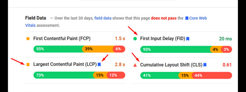
PageSpeed Insights
Page experience is a ranking criteria used by Google. And page experience includes the speed with which your page loads. Google suggests that mobile sites load in less than a second. Fortunately, PageSpeed Insights is a tool that tests for performance concerns.
PageSpeed Insights will evaluate your Core Web Vitals, which are a collection of criteria that influence page experience.
The following are the Core Web Vitals:
- Largest Contentful Paint (LCP). The amount of time it takes for the main content to load.
- First Input Delay (FID). The amount of time it takes for your website to respond to the first interaction (e.g., a click) from a user.
- Cumulative Layout Shift (CLS). How much your webpage shifts (or “moves down”) as more content (e.g., banners, images) loads.
To use PageSpeed Insights, enter your URL to obtain a detailed analysis.

Your report will look like this:
It also provides a Diagnostics report. This list contains existing mistakes and code that may cause your website to load slowly.
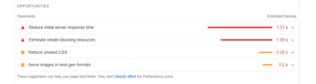
In addition, there is an Opportunities report that provides ideas for enhancing page speed. Increase page speed to improve user experience and demonstrate to Google that you are responding promptly to searchers’ requests.
6 Best Mobile SEO Tips
Now that we’ve covered the basics, let’s talk about how to optimize your site for mobile SEO. Here are six crucial mobile SEO guidelines and best practices:
- Create Mobile-Friendly Content
- Structured data should be used on your mobile website.
- Find Voice Search-Friendly Keywords.
- Optimize Mobile Site Speed to Improve User Experience.
- Keep Track of Your Mobile Keyword Positions
- Compare the performance of desktop and mobile websites.
Conclusion
All of the mobile SEO tactics, tools, and settings we’ve covered so far are important for the success of your Content Marketing campaign.
Still, we keep in mind that Google’s primary goal is to provide excellent information to its consumers, therefore your site’s content must be fantastic!
If you’re reading this, you’re probably seeking for new methods to improve your digital approach. Take a look at our Local SEO Guide for deep understanding on SEO topics.
Check out more educational articles on F60 Host. We also have blogs on Keyword Optimization In SEO to help you find the best keywords for you to rank on Google.
If you would like a blog on a certain topic, please feel free to contact us at F60 Host.